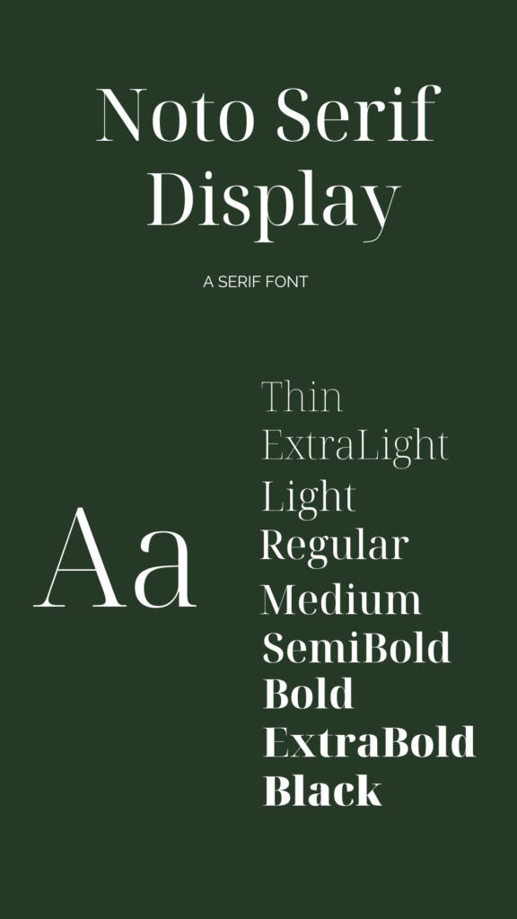
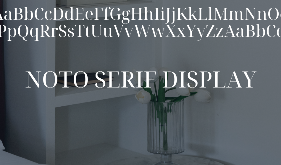
By far one of my favorite font (can’t you tell?!) for headings on websites!

Noto Serif Display is a typeface within the Noto font family, developed by Google. The Noto font family aims to provide a comprehensive and harmonious set of fonts that support a wide range of languages and characters. Here are some key points about Noto Serif Display:
Where to Use It
Noto Serif Display is specifically designed for use in display settings, such as headlines, titles, or other large-sized text. Its design makes it well-suited for grabbing attention and making a visual impact.
Being part of the Noto Serif family, Noto Serif Display features the characteristics of serif fonts, including small lines or strokes at the ends of letters. This gives it a more traditional and formal appearance.
While Noto Serif Display is suitable for display purposes, the Noto font family as a whole includes various styles and weights, making it versatile for both display and body text.
If you’re considering using Noto Serif Display, it’s important to assess whether its design and characteristics align with the visual identity and readability requirements of your project. Additionally, since it’s available on Google Fonts, you can easily incorporate it into your web designs for a consistent and appealing typographic style.


