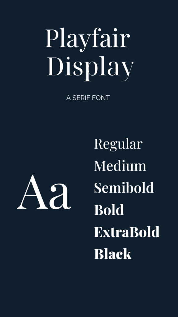
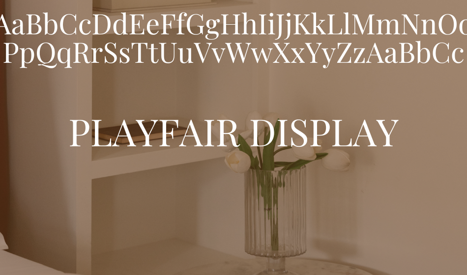
Playfair Display is a versatile and elegant serif font designed by Claus Eggers Sørensen in 2009. Inspired by late 18th century Scotch Roman designs, it has a refined, vintage quality but also feels fresh and contemporary. If you’re looking for a great heading font that’s bold and easy to read, Playfair Display is the one!

With its moderate contrast, large x-height, and short descenders, Playfair Display has an open, highly readable design. Available in a range of weights from light to black with complementary italics, it can work well for both text and display purposes, from book covers to posters to web use.
Playfair Display brings a timeless, stylish serif aesthetic that nonetheless feels modern and practical. Its classic but current style has made it a popular choice for designers across print and digital media. When I’m working on a website that needs a professional but comforting headline, I typically lean towards Playfair Display!
Available in Google Fonts? Yes.


